To go with neutrals or not to go with neutrals, that is the question. Well, that’s a question that I am often asked by friends and clients alike. There are two opinions that I find regarding neutrals: there are those who think that neutrals are mediocre and want to avoid them at all costs and then those who think that neutrals are too easy to work with and are ready to get drunk on them. ! So where on this extreme spectrum of opinions am I? I disagree with both – neutrals are definitely not boring, and secondly, they are not as easy as most of us think they are. There are ways to do it.
In this blog post, I’ll share with you some simple and easy-to-follow tricks that will give you the confidence to decorate your space with neutral colors.
Tip # 1: When in doubt stick to the monochrome color scheme
I cannot stress this enough. This works especially best when you have a small space but want it to look spacious. That was exactly my intention when I set out to design this vanity corner for a client.
Decorating with diluted colors of a particular color allows the eye to roam tight spaces. I picked the subtle variations of the veneer clad dresser and used them on the distressed tiles and ornate wood mirror. I have further strengthened the scheme by overlaying it with metallic details for a luxurious feel.
Tip # 2: Introduce key silhouettes
This approach works well for both traditional and minimalist styles, where the focus is on a few key pieces to bring the whole scheme together. These stately armchairs and cherub-shaped console table that we painstakingly design and manufacture (I have a lot to talk about our custom furniture, but would need a full blog for that) bring loads of visual intrigue and sculptural appeal to the setting.
Remember to have at least 2 key furniture in neutral colors to generate interest in your design.
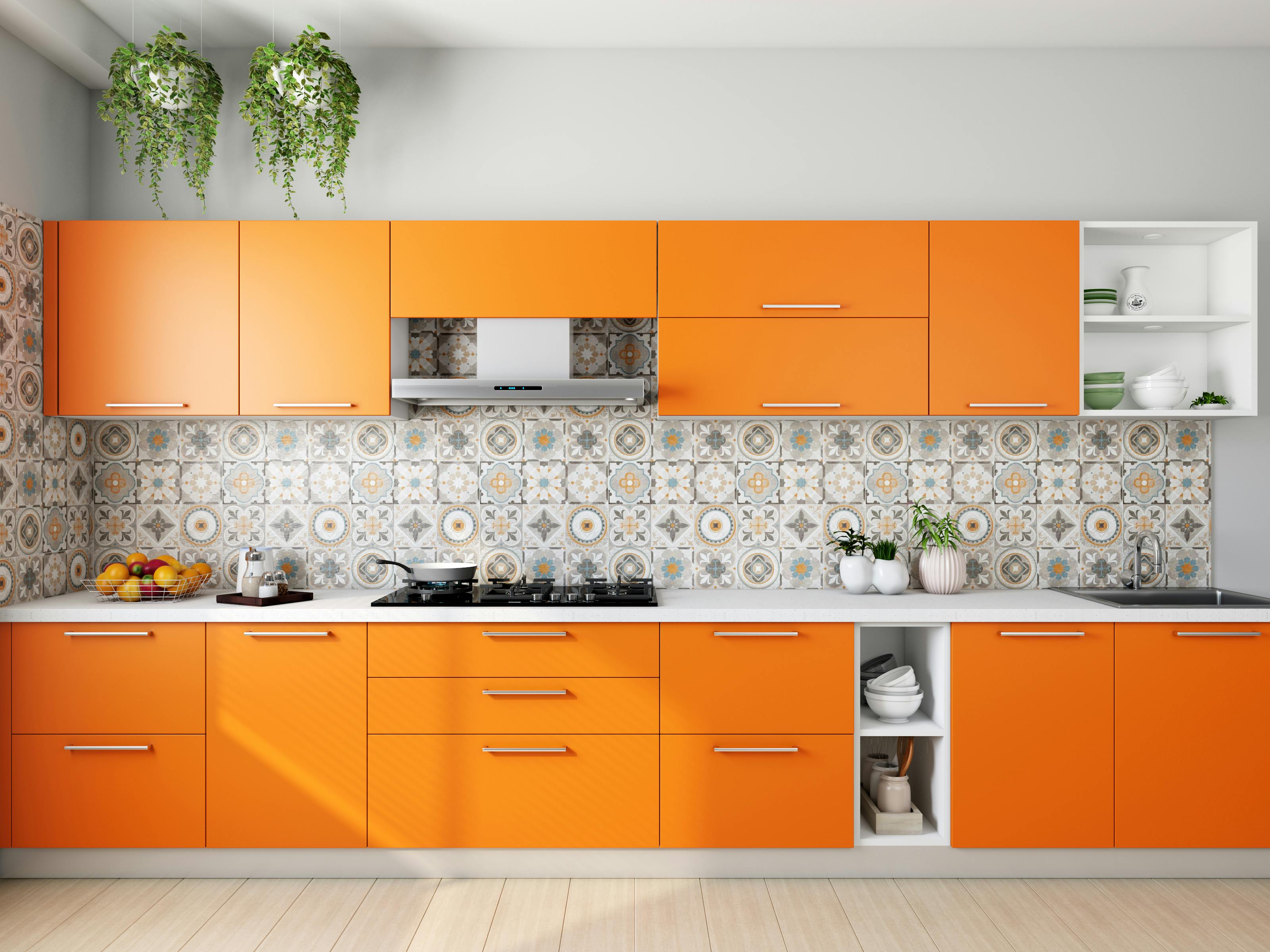
Tip # 3: Wield All White Power
Oh my sweet God! A completely blank space? She’s crazy? I’m sure when I proposed this all-white kitchen to my client, they must have had this thought. Of course, they were too sweet to say that, but he could feel their inhibition. The thing about an all-white color palette that color-loving Indians are skeptical about is, you guessed it right, the lack of color, which means no fun, no life, no warmth, and it’s all too much. clinical.
But that’s not true and this kitchen proves it. The kitchen has this relaxing and sophisticated feel. I think the crispier and lighter a kitchen is, the better. You will notice that I have strategically added another neutral to balance things out and add depth: the black on the kitchen counter and the island counter.
There’s another decorating detail that adds a certain level of warmth to all this chill – the brick backsplash that creates a charming rustic vibe. Also contributing to the variety in this clean scheme is the eggshell-toned fireplace.
Tip # 4: Add a soft color to the neutral mix
This room with that blush honestly made my knees shake! As I was sitting with the client of this beautiful property and scanning the many shades of warm colors, as that was what we initially had in mind, I saw this faded pink hue and knew in that moment that it was becoming my star color.
I created a mini designer moment with the tone on the beautifully carved upholstered bed (can’t thank my team enough for this) and then used it in nice jets through the accent pillows and paneled wall, which has just the right touch. . from the rosy rosy. Neutrals and pinks look like a happy family together, right?
Tip # 5: For a fail-safe interior, go for the classic black and brown
I totally swear by this trick. You can never go wrong with this classic color combination. This lobby that I recently put together for a client’s stately vacation home is a shining testament to this. The glossy reflective black of the pianoforte, the matte black of the wall light and the aged wrought iron stair railing offer a variety of finishes. Black also provides the right amount of tension and depth to the lobby, which has another dominant brown color.
The browns come in the paneling, carpet, chandelier and top of the pianoforte, which contrast well with the blacks (both bring out the best in each, right?). This is one of my favorite interior setups of all time!
So that was it! I hope you are no longer afraid or sitting on a fence over neutrals – they are beautiful and far from boring. While writing this blog post, I realized that I have worked with this scheme more than I can remember and of course I will continue to work with this elegant and timeless scheme when the opportunity presents itself! Please feel free to ask me questions in the comment box below!